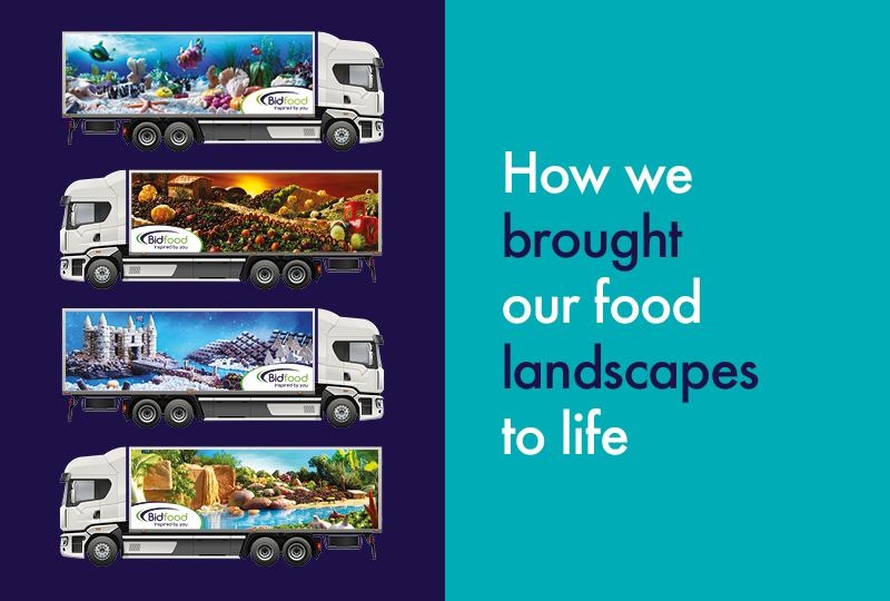
We sat down with Danny Gould, our Studio and Production Manager here at Bidfood, to gain first-hand knowledge on how these new additions were brought to life, as well as his involvement in this exciting campaign.
“To say I’m proud of the final landscapes is an understatement. From the start, we had our competition drawings to inspire us, but until we started putting flapjacks, coffee beans and carrots into place, we didn’t always have a clue what would work. Thankfully, the final results were great!.”
How long have you been part of the Bidfood team?
15 years, I started as a junior art worker, working mainly on our price lists. They used to be done externally, but when they were moved in-house, the task was handed to a 19-year-old me.
From there I worked my way up, and now I’m designing liveries out of real food!
How important is design when working on a campaign or project?
Massively important! The design must communicate your brand clearly, as it’s the first thing people see and remember. If something doesn’t look good, you’re instantly uninterested and it doesn’t matter how good the content is. You could read the best story ever but if it isn’t eye-catching, you could miss it.
Design is also emotional; you have to get the design to fit the emotion you’re trying to convey to people.
We took all of this into consideration when designing our landscapes.
What was your role in creating the landscapes?
The first thing I had to do was determine what we were going to achieve with our landscapes. Like our previous landscapes, they had to communicate the Bidfood brand, reflect our passion for food and evoke positive and playful feelings.
During the ‘Design a Landscape’ competition, we had Bidfood employees and their families submit their own drawings and photos to inspire the next landscapes. Channelling Simon Cowell, I led a team of judges to select the four winning designs from nearly 100 entries.
Our decisions were not just based on which designs would best represent Bidfood, but on their ability to be built from food items. We couldn’t believe how many resident artists we’ve been housing at Bidfood. Some of the drawings were phenomenal, but we had to make sure the ones we picked could be made out of food and then translated into landscapes.
I then went to the food photography studio, where our original three landscapes were built. They had the experience and the original food landscapes were such a success that they felt like the obvious choice.
I travelled to the photography studio to plan with them how we were going to build the landscapes. This involved drawing sketches and thinking of the ingredients we’d use – we ended up writing the world’s longest shopping list – Bidfood Direct to the rescue!
How were the landscapes constructed?
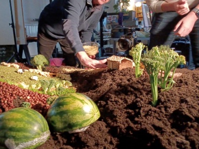
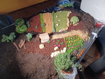
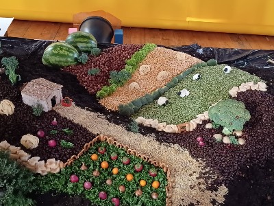
The first step was to lay the foundation. We used compost to shape the base of the landscapes and create different levels like the hills in the farm landscape.
We then started with the food placement, but before we could do that, some things needed to be peeled, chopped, toasted and sculpted in order to achieve the right size, colour and texture. It’s crazy how precise every piece of food needed to be in order to be placed – absolutely fascinating!
I rolled up my sleeves and got stuck in too. I was in the kitchen slicing pieces of starfruit, on my knees pouring couscous paths and of course, snacking on anything that wasn’t used. It was an amazing experience.
We then photographed the final masterpiece and did any last minute editing, such as the addition of the sky and water on the computer.
How long did it take?
Well as the saying goes, perfection takes time. We spent two days on each landscape, but in total, the four landscapes took three weeks to be completed.
What challenges did you come up against?
One of the biggest challenges we had was around perspective. Everything needed to match and sit within the right proportions of what we were trying to build with the food we ordered from Bidfood Direct.
Another challenge we had was keeping the food fresh, especially the fresh produce. We couldn’t place the actual landscapes in the fridge, so the studio had to be kept at arctic temperatures. But there’d be times when we go home in the evening, everything all good, then return the next morning and find that the lettuce had wilted and had to be replaced.
Bringing these to life required a lot of trial and error. I spent two hours, building a Ferrero Rocher mountain with cold, numb fingers. We placed it in the castle landscape, took a photo and it just didn’t work, it stood out from a mile away. It had to be dismantled.
And then there were the food models, the barn, the tractor, and the castle. They were not easy to build and even harder to keep standing and look realistic.
How did you incorporate graphic design into the landscapes?
The only thing we did from a graphic design point of view were the backgrounds. The different skies, the snow and the water effects were all done in Photoshop at the end of the process – everything else was real! We’re a food company, we wanted to do this with food, and I’m proud that we did it that way.
Which landscape is your favourite?
I love them all for very different reasons! But if I had to choose, it would be the farm landscape because of the technicality. It was fun getting the look of the fields right, perfecting the proportions and the undulations in the compost. Oh, and we can’t forget the cauliflower sheep!
Which one was the hardest?
The castle landscape because we had to build the castle out of scones and flapjacks, which trust me, isn’t easy!
Plus, we were dealing with chocolate, so we had to keep the temperature of the studio extremely low for those two days. We couldn’t afford to let it melt, which meant doing the majority of the landscape build in the freezing cold and in my coat, but it was totally worth it.
I’m so pleased with the finished designs and can’t wait to see them out on the roads – keep an eye out for them!
Read more about our landscapes here!
(All leftover food was donated to food banks and local charities)
